Content Warnings: images and discussions of drug use, abortion, sex, over-dosing, and beating people up. Some insensitive portrayals of lesbian, gay, and transgender characters.
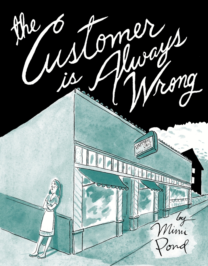
I was surprised to hear Mimi Pond created this second book, entitled The Customer is Always Wrong (Drawn & Quarterly, 2017). I was under the assumption that it took her a very long time to write and illustrate her first book, Over Easy, which I reviewed last year. Pond’s 2017 graphic novel is another glimpse into her life as a diner waitress/ unknown cartoonist in the 1970s. Pond labels her books “fictionalized memoir.” It’s a term I’m hearing more often, lately from Lidia Yuknavitch, and I haven’t decided how I feel about authors messing with “The Truth.” Are they simply changing names and places? If so, why not note that instead? Or is the memory spiced up, whittled down, twisted around?
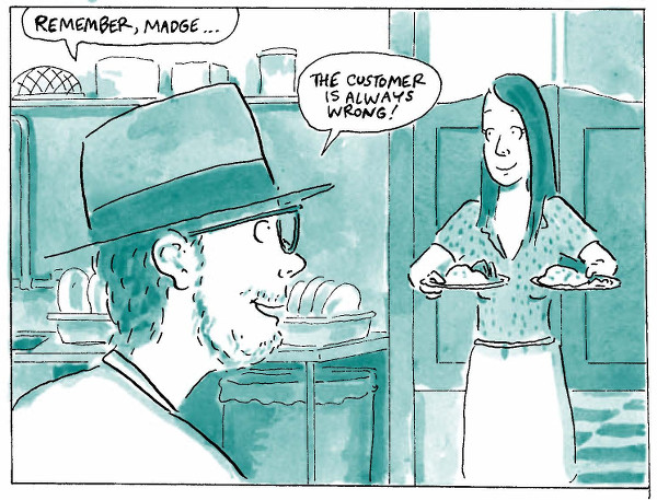
Pond’s second graphic novel is tightly plotted. The story line always moved forward, starting with Madge (Mimi Pond) dating a beautiful but crummy guy and getting readers back to the Imperial Cafe.
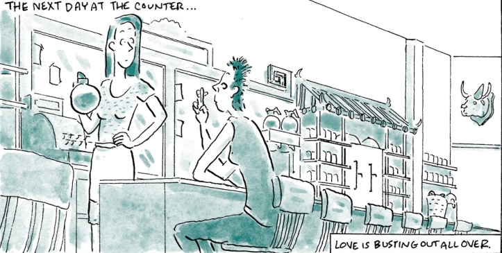
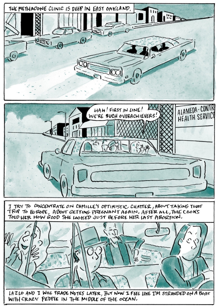
One waitress, Camille, has an obvious drug problem that complicates Madge’s life when Camille and drug-addicted boyfriend Neville move in next door. While Madge and her manager, Lazlo, try to help the addicts get clean, readers learn that both Madge and Lazlo use “acceptable” 70s drugs, like pot and cocaine, so their do-gooder attempt to help their co-worker kick heroin seems hypocritical. At the same time, Madge’s cartoonist career may be taking off, which could lead to a move to NYC. The plot was clearer than that of Over Easy, although it had just as many characters, making it the more enjoyable graphic novel. Readers may feel a bit behind if they haven’t read Over Easy, but they should easily catch up if they read The Customer is Always Wrong as a standalone.
Possibly because the plot is clearer, I found The Customer is Always Wrong more interesting than Over Easy. Though Madge was doing the same job, her art ambitions developed, giving her more depth and a life outside the Imperial Cafe. I also felt like I was getting a unique perspective on labels in the 1970s. Today, everyone labels themselves — just look at Twitter bios — but in The Customer is Always Wrong, they are hard to pinpoint. Madge seems like a good girl, but her choices about sex, drugs, drinking, abortion, and being helpful all depend on the situation. She doesn’t have maxims or pre-determined choices about morals that I can see, and I found that fascinating because it’s so contrary to what we expect of people today. The characters just roll with it.
Lastly, the art is that same blue wash I saw in Over Easy. Nothing draws too much attention to itself thanks to the limited color palate. All the characters have a unique element — maybe a hat or certain hairstyle — that make them all easy to distinguish. I still don’t love the text boxes on the bottom of panels when there is a text box at the top in the panel below, too. It’s easy to miss narration because I think the words are for a different panel. Really, my eye is missing the cue that it should move all the way down, meaning the flow is disrupted in a way it should be.

Yet, The Customer is Always Wrong is an engaging portrayal of the origins of cartoonist Mimi Pond that was a pleasure to read, and I hope there will be another book that covers her move to NYC. If you’d like to know more about Mimi Pond, check out my interview with her!

I give so much credit to people who can create art like that, that says so much. It’s a real skill, and if you add the skill of making people both think and laugh, I give even more credit.
LikeLike
I don’t know that I laughed much, but it did make me think about how I develop morals that I think I should live by, but they don’t always fit. It seems like in the 1970s that people did what felt right when it happened. I’m reading a novel right now called Looking for Mr. Goodbar that is also set in the 1970s, and I’m seeing similar behaviors.
LikeLiked by 1 person
As someone who was young in the ’70s, I agree we weren’t so hung by taking moral positions. I think that’s partly why I get so sick of all the preachy liberal stuff that so much modern fiction contains – I reckon we should all just live our lives and leave other people to live theirs and not keep trying to force our moral standpoints on each other. Go with the flow, man – groovy!
LikeLiked by 2 people
😂 So funny! It was less like Madge didn’t have standards and more like she just made a decision whenever something happened. That DID leave her crazy unprepared in some situations, though.
LikeLiked by 1 person
Unprepared is what makes life fun… 😉
LikeLike
my thoughts exactly. well said
LikeLiked by 1 person
I like the art in this, but I still don’t find myself drawn to graphic novels. I’ve even been flipping through them a lot at the library, but am still not interested.
And I’m with you – it bothers me when I don’t know what’s true in the book and what’s not. But I also get why they don’t want us to know everything.
LikeLike
What is it about graphic novels that turns you off? Maybe I could recommend the right one!
LikeLiked by 2 people
I think it’s just that I don’t like having to look at all the pictures – I just want to read. I’m not sure if you could suggest a graphic novel that solves that problem! 😉
LikeLike
Drawn and Quarterly is a fabulous publisher, they are a Canadian gem that we feel very proud of here up north 🙂 Also, love the new format!
LikeLiked by 1 person
Thank you! The blog templates sure have changed over the years. Problems I used to have don’t exist anymore thanks to some of the new templates.
I think Drawn and Quarterly has really taken off in the last few years. Unless they’ve always been super productive and I just didn’t notice. These days, when I read a graphic novel, it’s pretty much always by Drawn and Quarterly, and it’s not an intentional choice, so they must be at the head of the pack!
LikeLiked by 1 person
Hmm, that’s good to hear that even Americans are familiar with it!
LikeLike
I have always struggled with graphic novels though I’m not sure why, perhaps because they have more text than comics without the flow of a text novel. As for morals, we had a pretty big legalise abortion push going in the 70s in Australia, though backyard abortions probably ended in the sixties.
LikeLike
A really, really well-planned graphic novel will have amazing flow. Your eye will know exactly where to go without you having to try.
LikeLike
Interesting. I don’t read many graphic novels, but I might add this one to my TBR list. In my day job, I’m dealing with some policy issues concerning customers and sexual harassment of restaurant workers (as well as trying to raise the tipped minimum wage). So, this is timely for me (even if it doesn’t quite address those issues).
LikeLike
I think the first one, Over Easy, focuses more on what happens in the restaurant. This book takes us out of it quite a bit.
LikeLike
I actually like the idea of workplace stories, but I bet I would enjoy this one too, if I’d read the first one. Just checked the library and see it has both of these, so I’ll make a note for my next seige of graphic stories. I seem to go in phases with them. Once I start in again, I want every book to have pictures!
LikeLike
I tend to read more of them at the end of the year. I realized, after I read a post by my blog friend Lou, that Goodreads starts noticing how far behind I am on my reading challenge (“You are now THREE books behind, LOSER!”), so I get panicked and begin reading shorter books. It’s a terrible motive, but I also really like graphic novels anyway.
LikeLike
One of the things I’ve really liked about the graphic novels I’ve picked up this year is the art. This one seems to focus more on content. I’m really liking your blog’s new look by the way. It’s always nice to shake things up. I would give my blog a makeover, but I’m kind of afraid it wouldn’t look as good as it does now. It was more like luck than actual skill that led to its current look.
LikeLike
I don’t remember you reviewing any graphic novels! Links?
LikeLiked by 1 person
I’ve only done a couple of mini-reviews because I’ve gotten in the habit of picking them up when I’m just not in the mood to write a review.
LikeLike
I think reviewing graphic novels is harder because I include images from the book, which I usually have to scan, edit, etc.
LikeLiked by 1 person
I love the drawing style!
LikeLike
This is the sort of book I’ve really been into lately– It reminds me of reading The Best We Could Do by Thi Bui. It’s a graphic memoir, but it’s “fictionalized” a bit in order to make the story more crisp. Events are rearranged a bit, situations cut back some– everything to make the story more meaningful. The coloring (red-oranges in Bui’s graphic novel) is also quite similar. I like the idea of taking the “good parts” from life and slicing them together to make a stronger story. Themes and messages are easier to read in this case.
I’m with you on the text bubbles being in strange places on the panels. I feel like I would do something similar and read down instead of across. Did this happen in her earlier graphic memoir?
LikeLike
It’s the exact same style in her first memoir, Over Easy. 🤦
LikeLiked by 1 person
Note to self: Read both these memoirs. ASAP.
I love that I’m starting the year with a bunch of graphic memoir/novel recommendations from you. Thank you!
LikeLike
You’re welcome! Let me know if you have any questions.
LikeLiked by 1 person
[…] didn’t I? Apologizes to Krysta @ Pages Unbound, Dani @ Perspective of a Writer, and Melanie @ Grab the Lapels for being neglectful with their […]
LikeLike